Web Platform
Introduction
The Bettair platform is a web tool that allows you to inspect and interact with the data captured by the Bettair nodes. Among its main functionalities, we find the representation of maps, generation of time-series charts, statistics, calendars with contamination indices, comparison between nodes, scheduling alarms, and download sensors data.
Each section of the platform is described in detail below.
Authentication
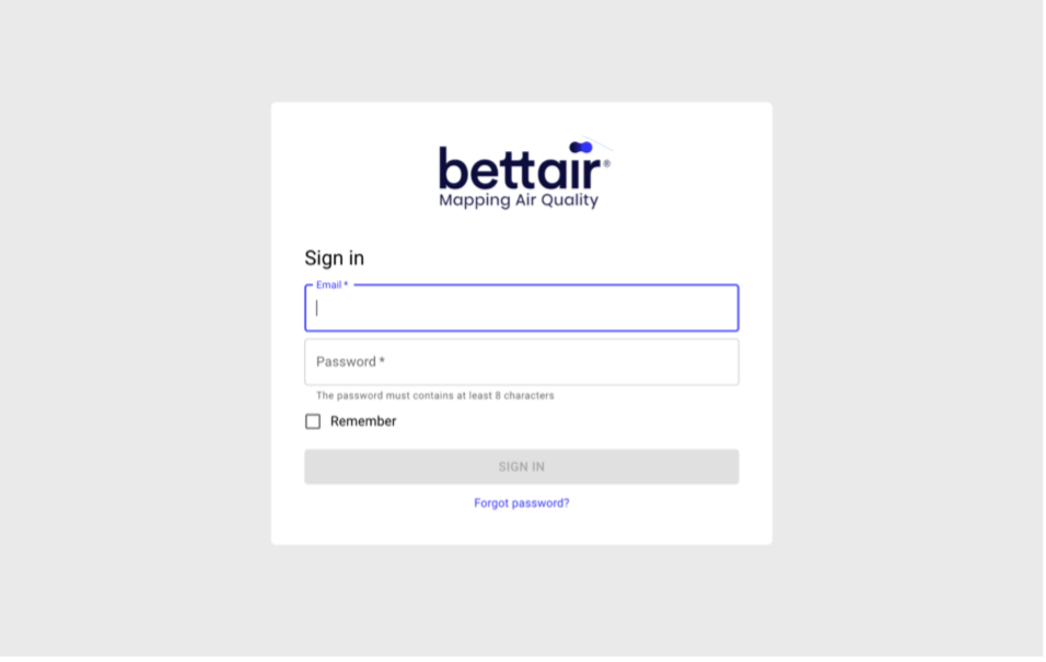
The authentication screen (see Figure 1) requires entering the user's email and an 8-character password. In case you don't remember your password, it is possible to recover your account by pressing the button "Forgot password?". The application will display a pop-up requesting the email associated with your account, if it matches with an active user account, an email will be sent with a link to enter a new password. This link will be valid for 24 hours.
Figure 1 Authentication screen capture
💡 Tip
You can select the Remember checkbox to keep the session active even after closing the current web browser tab.
User profile
The user profile screen allows you to modify the name and surname used when registering on the platform. It also allows you to configure the units in which the node data is displayed, and the contamination index used in the maps section and the analytics calendar. Changes made on this screen will only take effect when the Save button is pressed.
To access this screen, simply press the ![]() button located in the upper right part of the panel and select the "profile" option from the drop-down menu.
button located in the upper right part of the panel and select the "profile" option from the drop-down menu.
💡 Tip
Each user of the same organization can configure their visualization units and the contamination index (AQI / CAQI) used in the different sections of the platform.
Change password
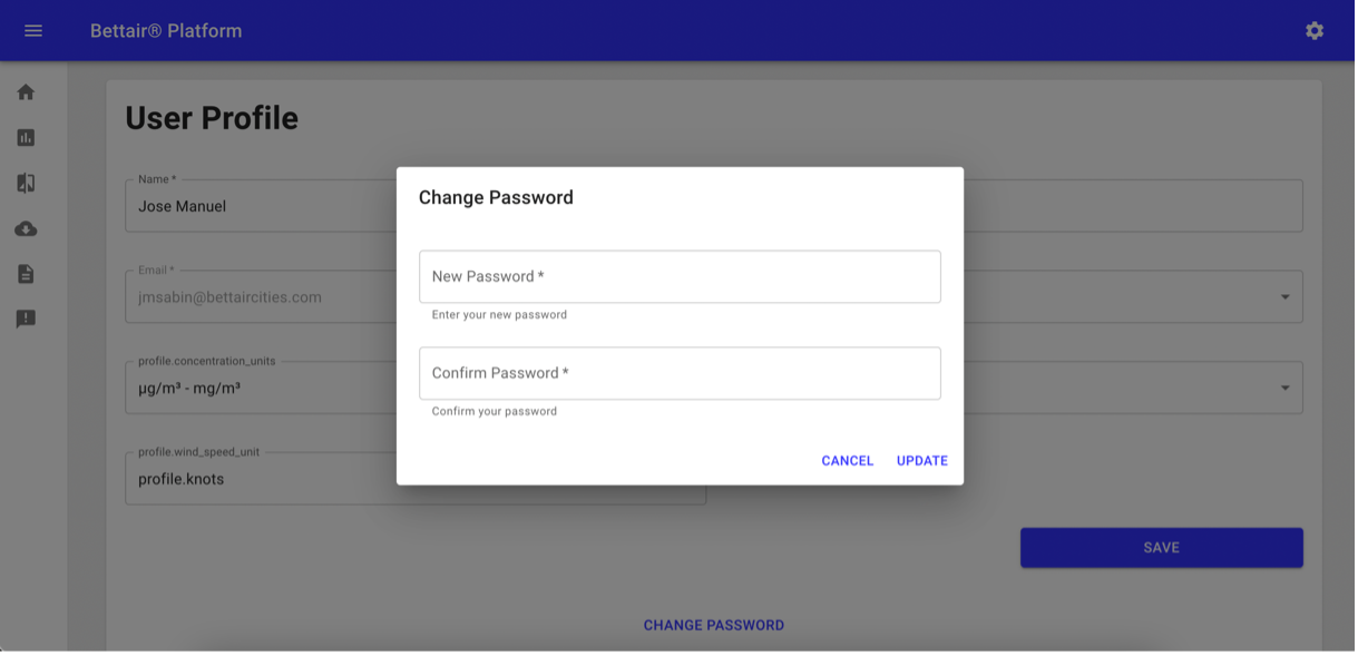
Another functionality available in the user profile is the possibility of changing the password. To do this, you must press the Change Password button located at the bottom of the user profile screen. Once the pop-up shown in Figure 2 is displayed, you must enter the new password and press the update button.
Figure 2 Change password pop-up screen
💡 Tip
Updating the password will close other sessions of the same user that might be opened in other web browsers
Organization
The main purpose of this screen is to manage user access to an organization's data. The registered users and those who have received an invitation but have not yet completed the registration process are listed in a table as shown in Figure 3. For those unregistered users, it is displayed the Resend Invitation button next to the invitation email, since invitations expire 24 hours after being sent.
Figure 3 Organization screen capture
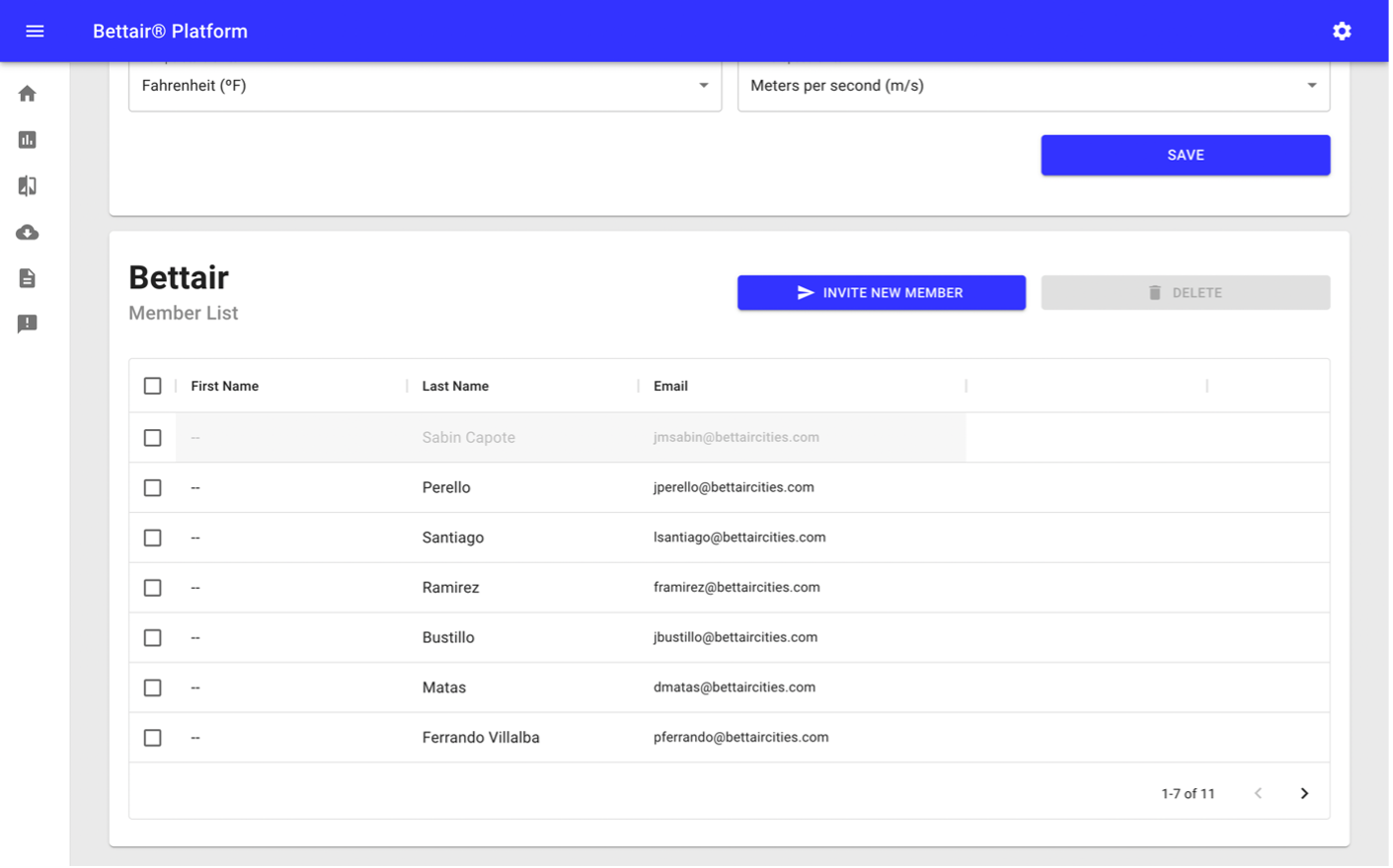
To send a new invitation you must press the Invite new member button and enter the new member email. These new members will receive an email with a link that will redirect them to the screen shown in Figure 4. To finalize the registration process, they must fill the displayed form including an 8 characters password and press the Join button.
Figure 4 Registration from screen capture
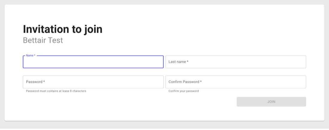
Once the registration process is finished, the user will be redirected to the authentication screen where they can start a new session. Besides inviting new users, the platform also allows you to delete existing ones. For security reasons, it will require to confirm this action through a confirmation pop-up
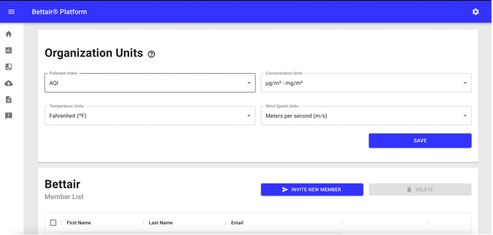
Organization Units
In the organization screen, you can also find a view called organization units (see Figure 5). This view allows you to configure the units of the auto-generated reports as well as the default units of the new members of the organization.
Figure 5 Organization units card view
⚠️ Warning
Changes in the organization's units only affect new reports generated after the date of the change.
Map
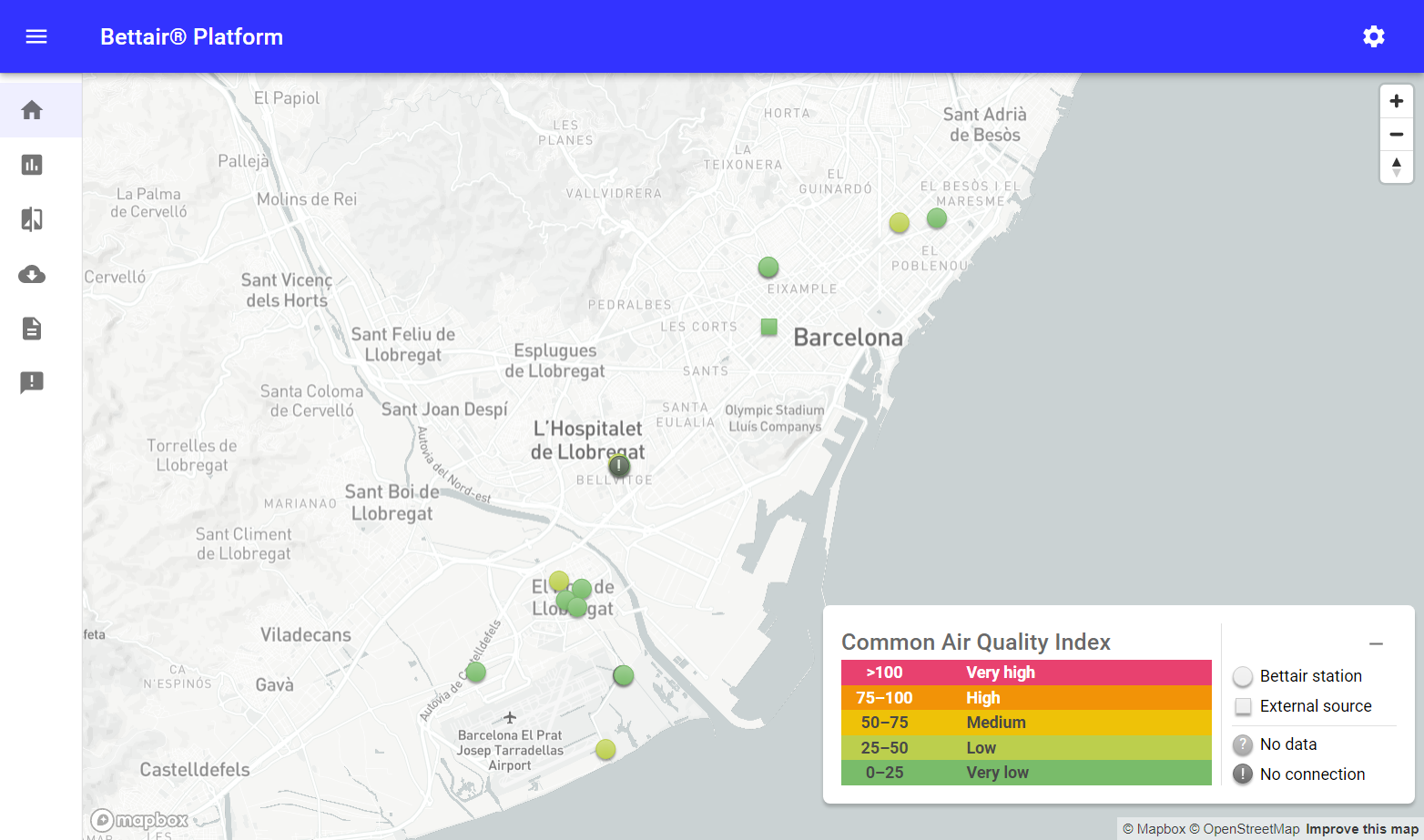
It allows visualizing the location of the nodes of an organization on a map (see Figure 6). Each node is represented by an icon whose shape varies depending on whether it is a Bettair® station or an external source, and its color changes depending on the pollution index value configured by the user, either the “Air Quality Index” (AQI) or the European version “Common Air Quality Index” (CAQI). Along with the nodes, a legend of the selected index is displayed.
Figure 6 Map screen capture
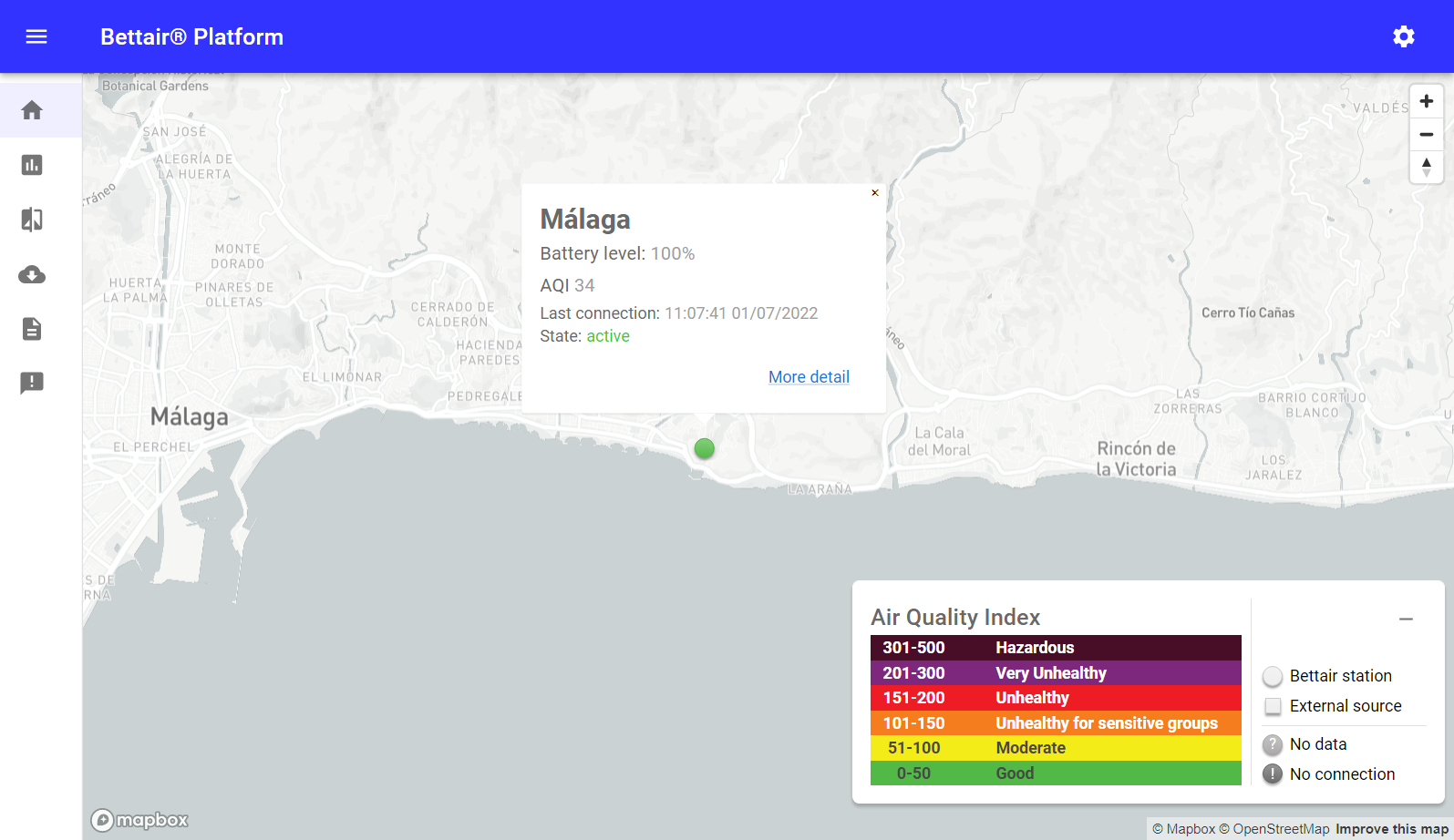
When selecting a node, a pop-up is displayed with basic information about the sensor as shown in Figure 7. If you want to see more information about a specific node, just press the "More detail" button to be redirected to the analytics section.
Figure 7 Map screen capture with pop-up
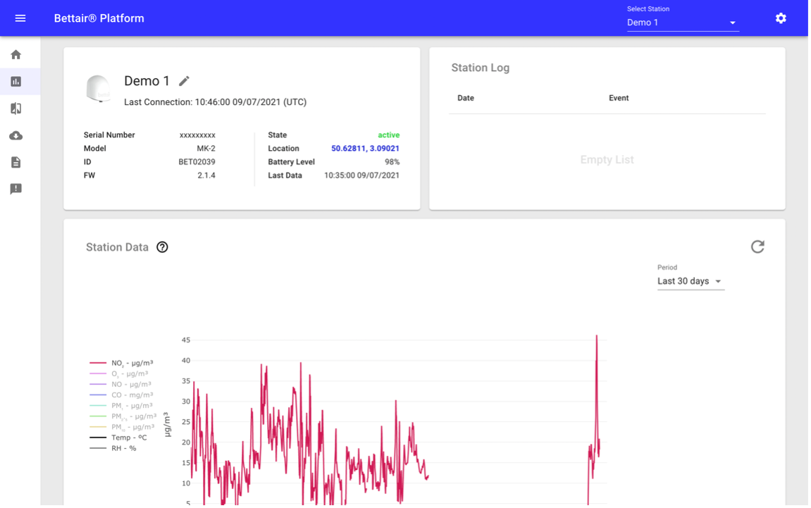
Analytics
The analytics screen contains several card views with information about a specific node (see Figure 8).
It can be accessed from the More detail button described in the previous section or directly from the ![]() button located on the side menu of the control panel.
button located on the side menu of the control panel.
Figure 8 Analytic screen capture
💡 Tip
At the top bar of this screen, you can choose the node of interest in a drop-down menu, this action updates the URL of the page, which is very convenient when sharing the link with other users of the same organization.
⚠️ Warning
All time series data provided by Bettair are left-labeled, that is it has a left-aligned timestamp
Each card or view present in the section is described in detail below.
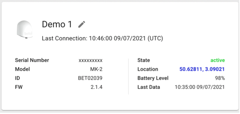
Station Information
Displays information specific to each node, such as its battery level, date of the last contact, firmware version, etc.
It is possible to update its alias by pressing the ![]() button shown in Figure 9, facilitating the identification of the nodes in each section of the platform.
button shown in Figure 9, facilitating the identification of the nodes in each section of the platform.
You can also see the current selected stations in a map by pressing the location coordinates.
Figure 9 Station information card view
Station Log
Shows the latest events reported by a node, such as device reboots, ongoing updates, among others.
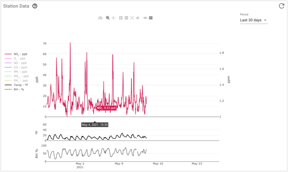
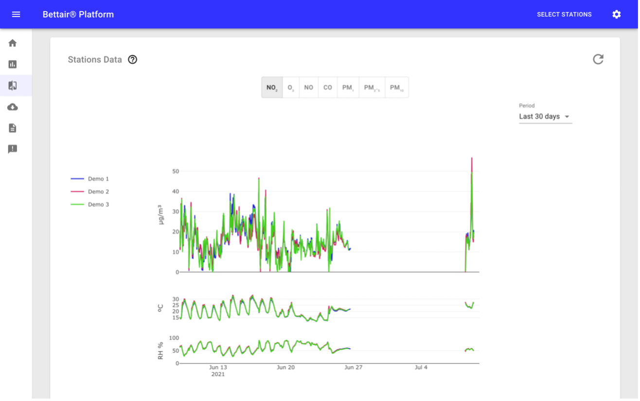
Station Data
This card view displays the data of each sensor integrated into the node through an interactive chart, for example, we can see the data of NO sensor, zoom on a date range by pressing the ![]() button, hide sensors by pressing their name on the legend, take screenshots by pressing the
button, hide sensors by pressing their name on the legend, take screenshots by pressing the ![]() button among other possibilities.
By default, this chart shows the last 7 days of data, groupings data to improve the chart performance, however, it is possible to select the data period through the drop-down located on the right side of the chart (see Figure 10). In the case of 2 days period or less, the data will be displayed at the highest resolution.
button among other possibilities.
By default, this chart shows the last 7 days of data, groupings data to improve the chart performance, however, it is possible to select the data period through the drop-down located on the right side of the chart (see Figure 10). In the case of 2 days period or less, the data will be displayed at the highest resolution.
Figure 10 Station data card view
💡 Tip
The units of the pollutants and the temperature shown in the chart above can be configured for each user. Changing units is described in detail in the User Profile section.
⚠️ Warning
All time series data provided by Bettair are left-labeled, that is it has a left-aligned timestamp
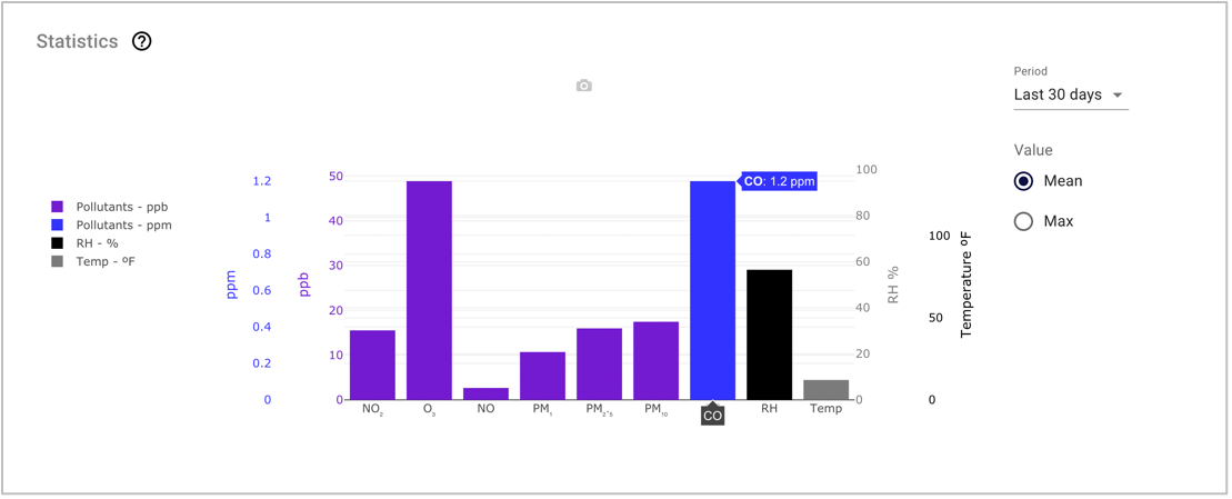
Statistics
This card shows the mean and maximum values of the sensors for the selected period as shown in Figure 11. As in the previous card view, it is possible to choose the period of interest from the drop-down located to the right of the chart.
Figure 11 Statistic card view
💡 Tip
The units of the pollutants and the temperature shown in the chart above can be configured for each user. Changing units is described in detail in the User Profile section.
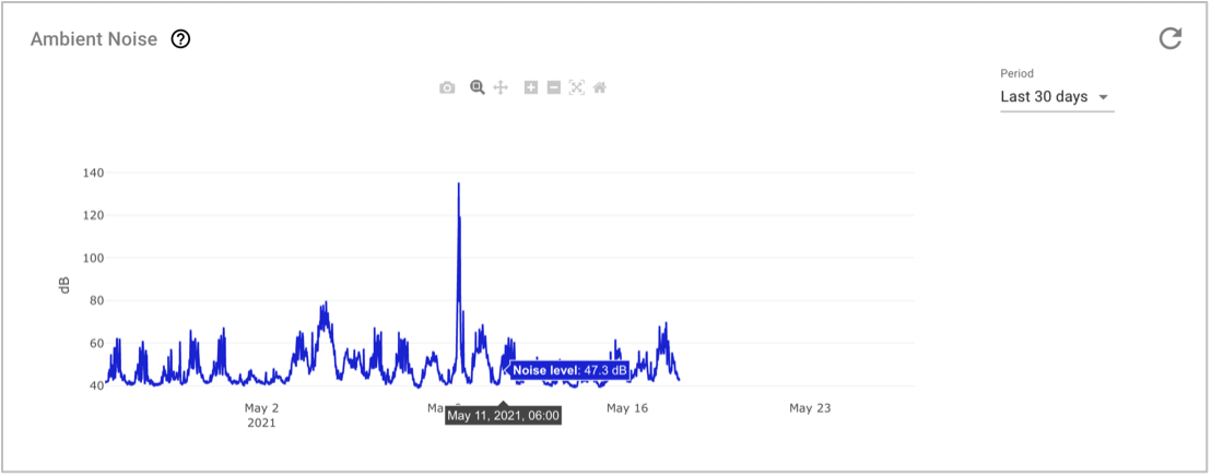
Ambient Noise
Due to the higher resolution of the ambient noise sensor data, it is presented in a separate chart from the rest of the sensors (see Figure 12), inheriting all the functionalities described in the Station Data card view.
Figure 12 Ambient noise card view
⚠️ Warning
All time series data provided by Bettair are left-labeled, that is it has a left-aligned timestamp
Pollutant Trend
It displays the behavior of each pollutant either daily (averages per day of the week) or hourly (averages per hour of the day), taking the last month of available data as the base of calculation. In Figure 13 you can see an example of the CO behavior, showing the average along with the maximum and minimum average for each hour of the day.
Figure 13 Pollutant Trend card view with CO data
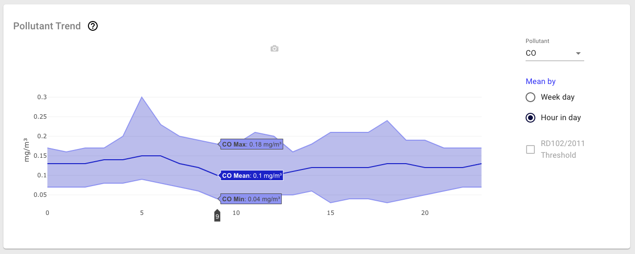
Some pollutants allow displaying a reference threshold from the Spanish Royal Decree by pressing the RD102/2011 Threshold checkbox.
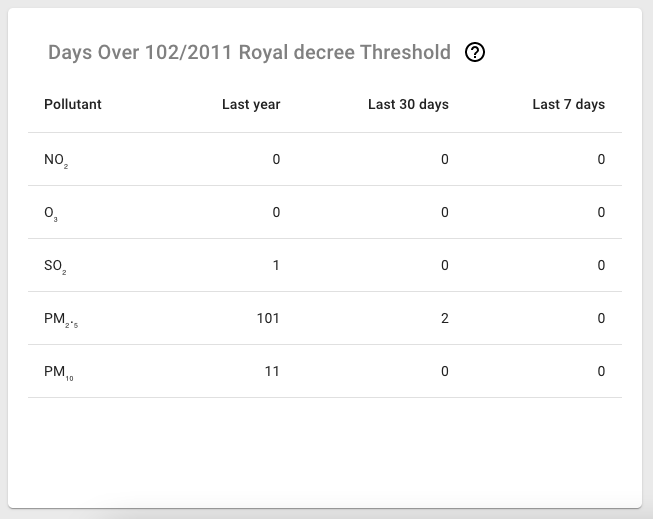
Days Over 102/2011 Royal Decree Threshold
This card view (see Figure 14) provides valuable information on the behavior of each pollutant. It indicates the number of times that it has been above the limits recommended by the Spanish Royal decree RD102/2011 for different predefined periods (last year, last 30 days, and last 7 days).
Figure 14 Example of the days over threshold table
Predominant Pollutant
This view contains a calendar showing the predominant pollutant for each day of the selected month. The predominant pollutant represents the variable with the greatest impact when calculating the pollution index configured in the user profile (AQI / CAQI). The index value can be consulted by sliding the mouse over each cell of the calendar. The design allows inferring at a glance the impact of the pollutant by the colored legend shown in Figure 15.
Figure 15 Pollutant trend card view
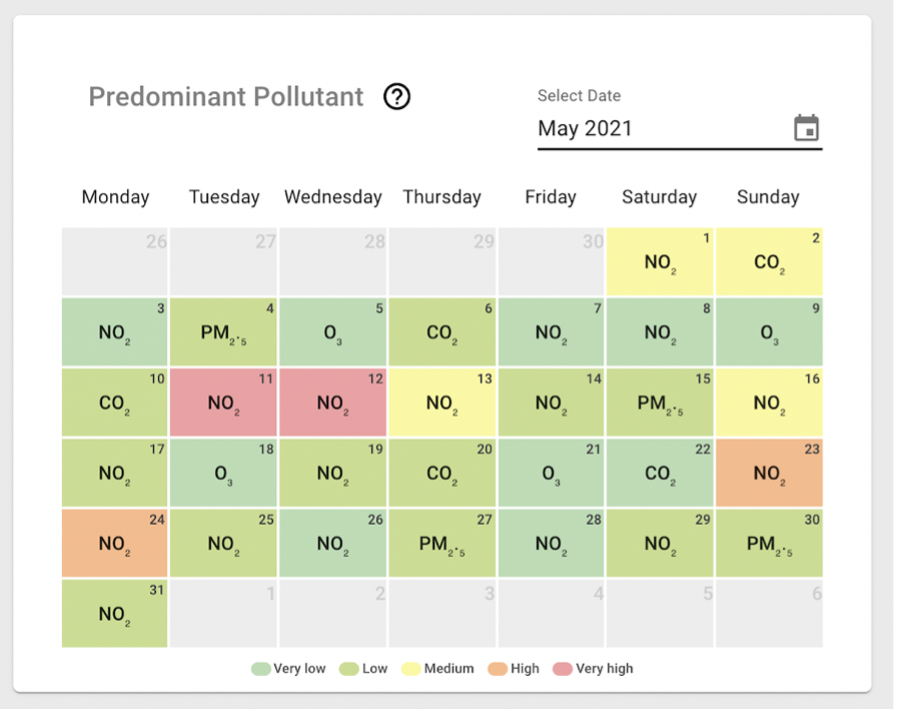
💡 Tip
You can find more information about how the Air Quality Index are calculated in the Air Quality Index section.
Node Comparison
This section contains a set of cards that allows you to compare different nodes with each other (see Figure 16). To access this screen just press the ![]() button located on the side menu of the control panel.
button located on the side menu of the control panel.
Figure 16 Node Comparison screen capture
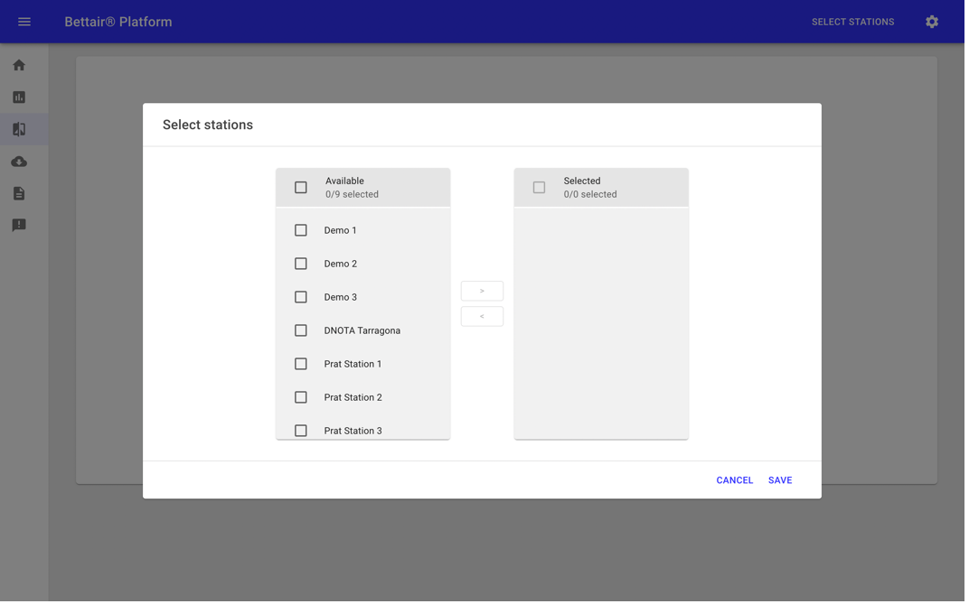
This screen requires that a group of nodes has been selected. You can select the nodes to compare by pressing the Select stations button located on the top bar. This action will open the pop-up menu (see Figure 17) where you can add or remove nodes.
⚠️ Warning
All time series data provided by Bettair are left-labeled, that is it has a left-aligned timestamp
Figure 17 Select stations pop-up menu
As shown in the analytics section, the selected nodes are reflected in the URL, which is very convenient to share with other users in the organization. Below is described in detail each card view present on the screen.
Station Data
This card shows the data of each sensor from the selected nodes one sensor at a time, except for relative humidity and temperature, which remain present at all times. It is possible to change from one sensor to another using the buttons located above the chart (see Figure 18).
Figure 18 Compare station data card view
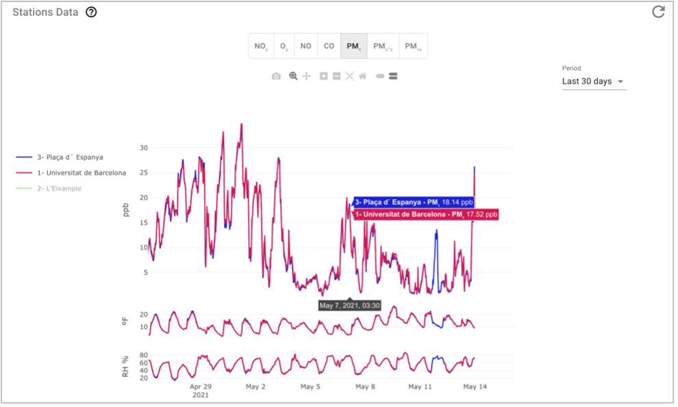
By default, this chart shows the last 7 days of data, groupings data to improve the chart performance, however, it is possible to select the data period through the drop-down located on the right side of the chart (see Figure 17). In the case of 2 days period or less, the data will be displayed at the highest resolution.
💡 Tip
It is possible to hide the data of a node without changing the selected nodes. You can press the name of the node in the legend of the chart.
The units of the pollutants and the temperature shown in the chart above can be configured for each user. Changing units is described in detail in the User Profile section.
⚠️ Warning
All time series data provided by Bettair are left-labeled, that is it has a left-aligned timestamp
Statistic
Displays the mean and maximum values of the sensors measures of each node for the selected period (see Figure 19). As described in the Station Data card view, it is possible to change the periods using the drop-down located to the right of the graph.
Figure 19 Chart with statistic values for each sensor of selected nodes
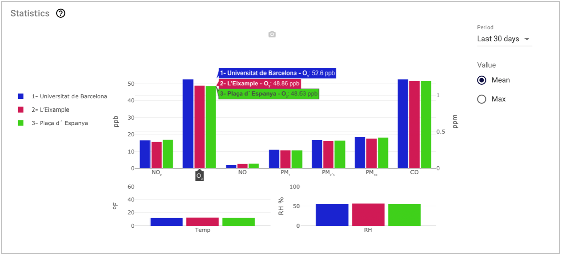
💡 Tip
It is possible to hide the data of a node without changing the selected nodes. You can press the name of the node in the legend of the chart.
The units of the pollutants and the temperature shown in the chart above can be configured for each user. Changing units is described in detail in the User Profile section.
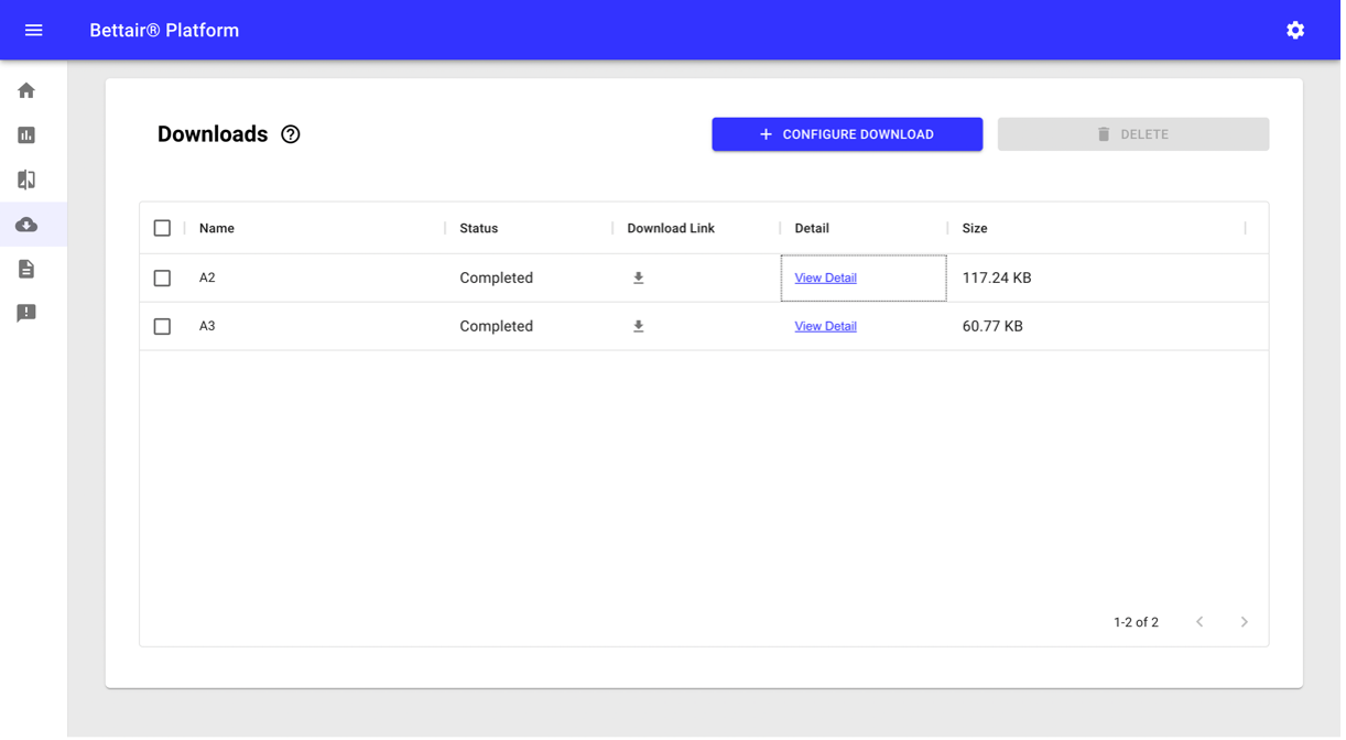
Download
This section of the platform allows you to set up the data to be downloaded (see Figure 20), It lets you set units, date range, nodes, and variables to be included in the zip file.
Figure 20 Download screen capture
To access this section, press the ![]() button located on the side menu of the control panel.
button located on the side menu of the control panel.
In this section, we find a table where all the downloads configured by the members of the organization are listed. Downloads might have the following statuses:
- Queued
- In progress
- Completed
- Error.
When creating a download setup, its initial status is “Queued”. The platform will manage the creation of packages based on available resources. Once the package starts to be processed, the status changes to "In progress", displaying a progress indicator. Finally, when the package is completed, the status changes accordantly. In this final status, a download button ( ![]() ) is displayed along with a packet size indicator.
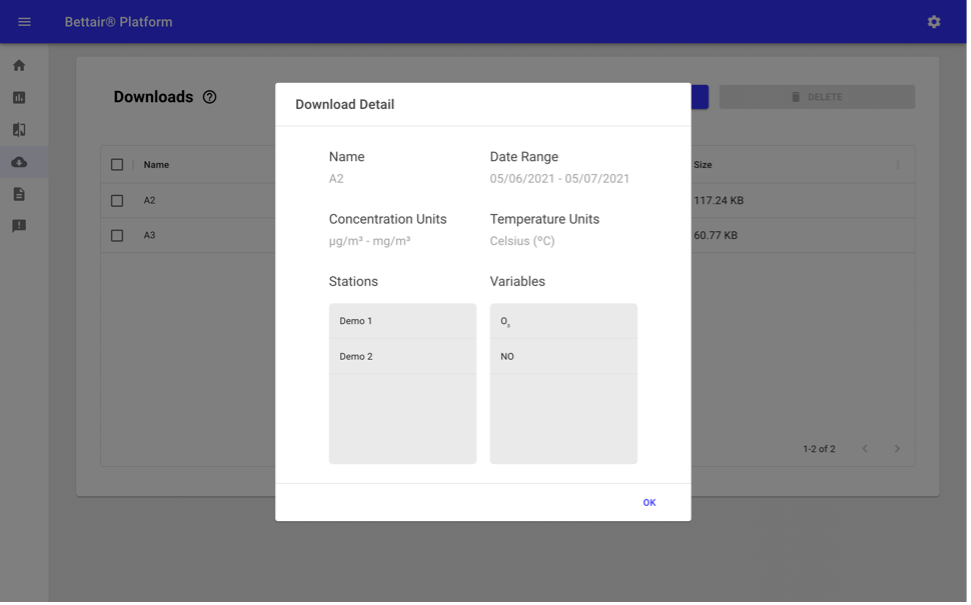
At any stage, it is possible to consult the setup of each download (see Figure 21) by pressing the See detail button.
) is displayed along with a packet size indicator.
At any stage, it is possible to consult the setup of each download (see Figure 21) by pressing the See detail button.
Figure 21 Download detail pop-up
💡 Tip
Download setups are shared by the organization. Actions of creating and deleting downloads will be shared with other users in real-time.
Downloadable packages files time zone are expressed in UTC. The CSV file format split columns with a semicolon ";" and the decimals with a dot "."
⚠️ Warning
If any user of the organization is downloading a package, it will be blocked so that it cannot be deleted by another member until the download is completed.
In case of an error event while generating a package, it will be indicated in the status column.
Downloads with a "completed" status will have a lifetime of 30 days. Once this time has elapsed, they will be deleted from the platform automatically.
All time series data provided by Bettair are left-labeled, that is it has a left-aligned timestamp
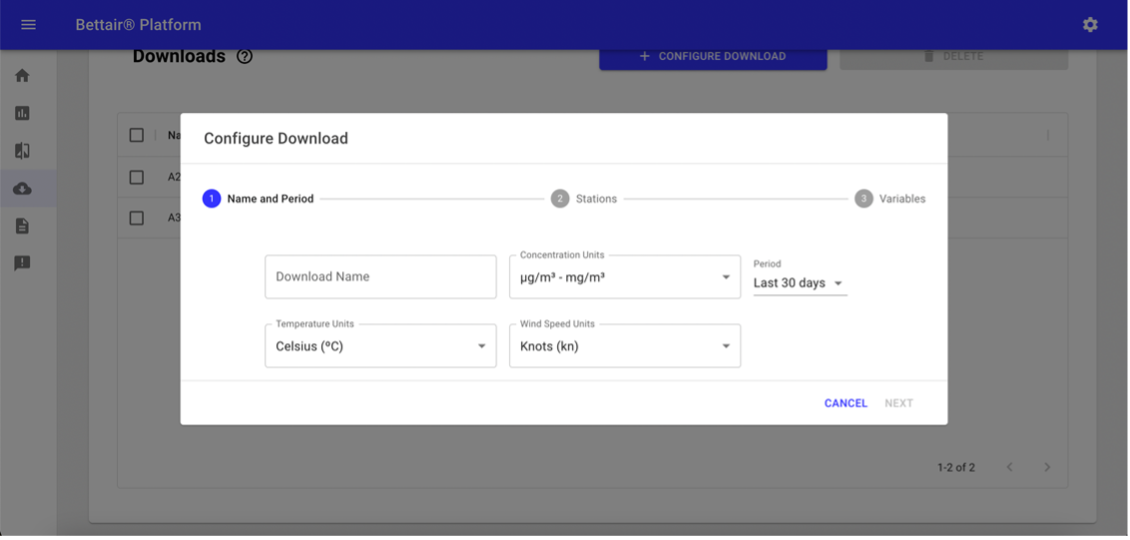
Configure Download
To add a new download setup, you can press the Configure new download button, this action will open a pop-up screen (see Figure 22) that will guide you through a 3-step configuration process. In the first step, you must indicate the name of the download, the units of the data, and the date range of the content.
Figure 22 Pop-up screen with the first step of downloads setup
⚠️ Warning
The download name field is mandatory to enable the "Next" button.
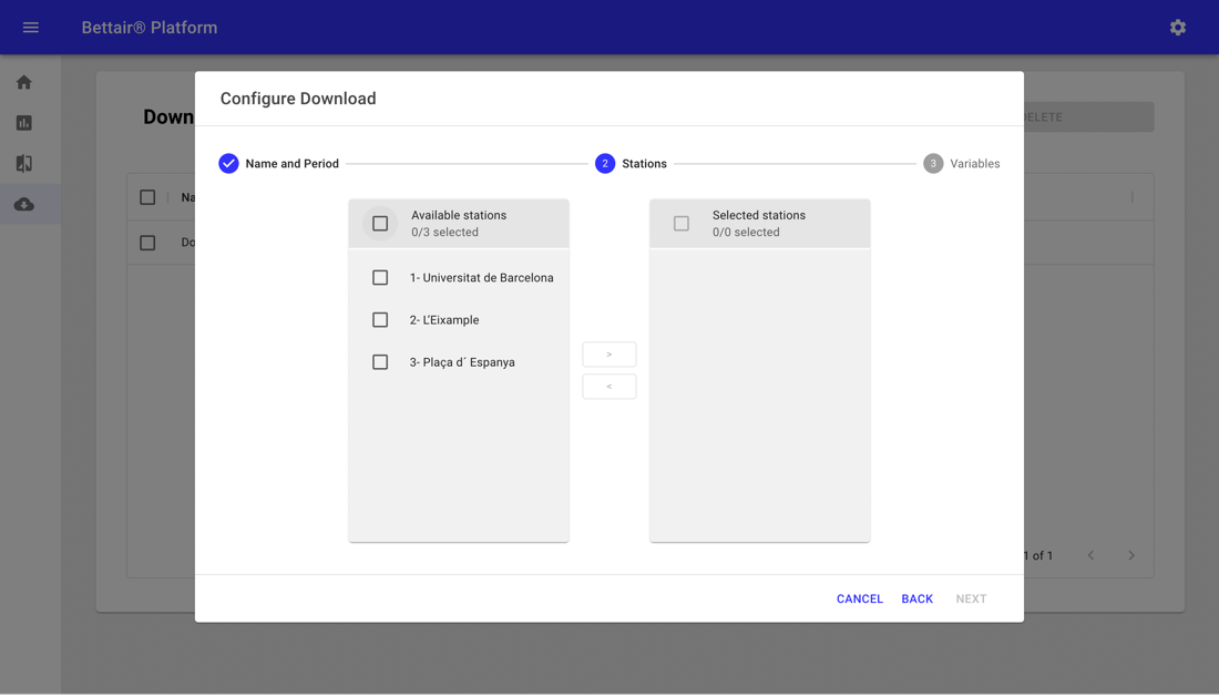
In the second step (see Figure 23) you must indicate the nodes that will be included in the download package.
Figure 23 Pop-up screen with the second step of downloads setup
⚠️ Warning
At least one node must be chosen to enable the Next button.
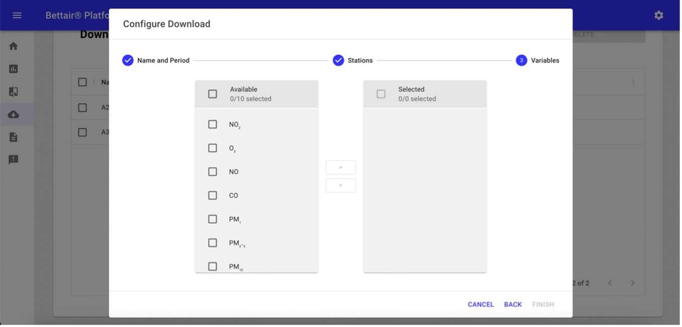
Finally, you must choose the variables to be included in the package and press the Finish button (see Figure 24).
Figure 24 Pop-up screen with the third step of downloads setup
💡 Tip
To modify the column and decimal separators of csv files, it is recommended to use a text editor, either the one that comes pre-installed with the operation system or using a free alternative such as Notepad ++.
The procedure is similar in all tools, you must open the file to be modified and select the Replace All option, usually located in the Edit menu, then indicate the character to change (Find) and the character that will replace it (Replace) to finally press the replace button.
In some tools the procedure may vary slightly. Therefore, it is recommended to consult the documentation for each application.
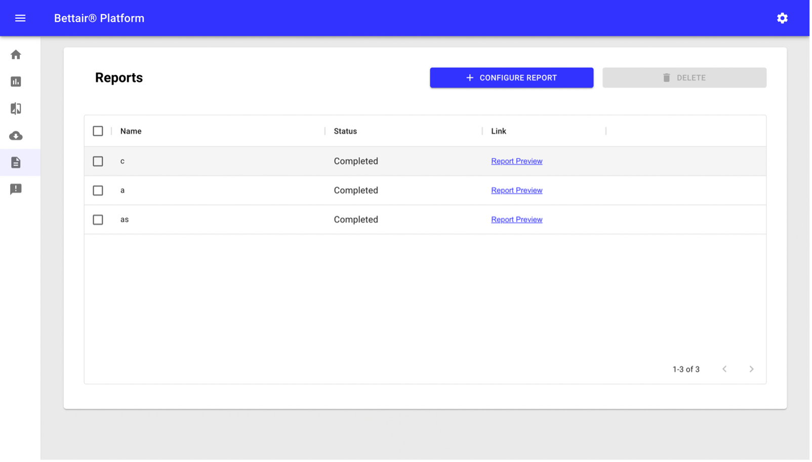
Generate Reports
The Bettair® Platform allows to generate Auto-Reports (periodically generated reports generated by the platform) and Reports configured by users. Auto-Report generation uses the units configured in the organization section, while the users generated report are totally customizable. The report screen (see Figure 25) can be reached by pressing the ![]() located on the side menu of the control panel.
located on the side menu of the control panel.
⚠️ Warning
Changes in the organization's units only affect new reports generated after the update.
Figure 25 Report screens
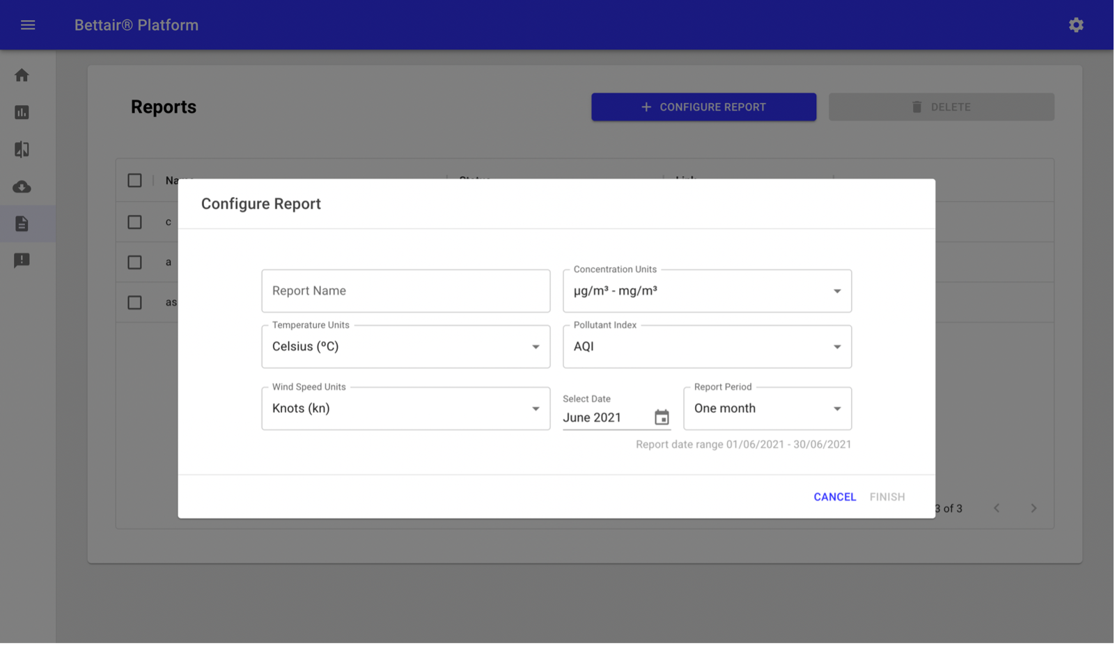
To configure a new report manually, you must press the “Configure report” button, which will display a configuration screen (see Figure 26) where it is possible to choose the units and periods of this report. Once all the data has been entered, the finish button is enabled.
Figure 26 Report configuration pop-up screen
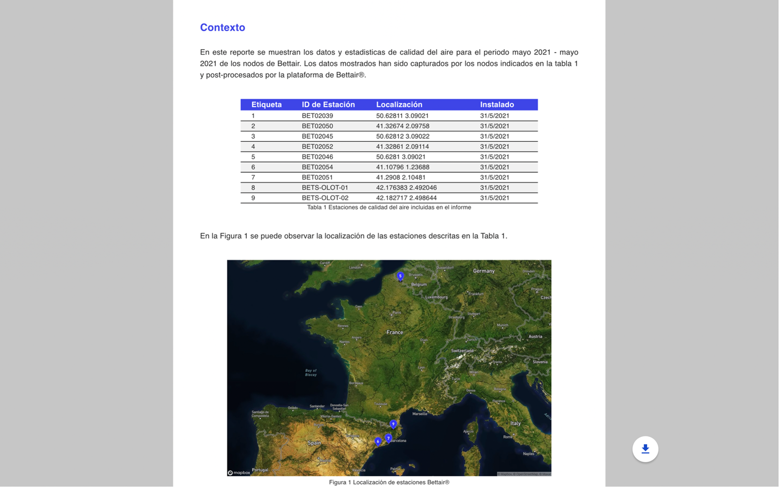
As in the download screen, the reports can have four states. Once the report status becomes completed, it is possible to preview it by pressing the Report Preview button, which will display a screen (see Figure 27) with the information contained in the report as well as a download button. This download button allows you to generate a downloadable PDF document.
⚠️ Warning
The PDF generation time may vary depending on the device and the amount of data included in the report.
All time series data provided by Bettair are left-labeled, that is it has a left-aligned timestamp
Figure 27 Report preview
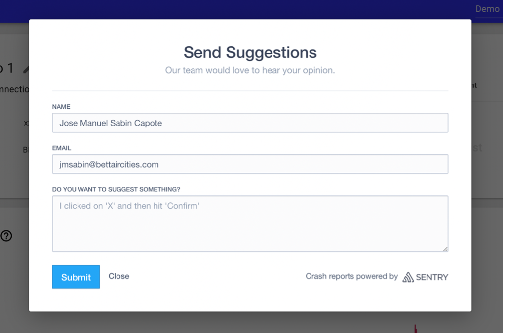
Send Suggestions
If you have any suggestions, you can send them to the Bettair team by pressing the ![]() button located on the side menu of the control panel, it will display a form (see Figure 28) where you can describe your ideas. All comments are welcome and will help us improve the platform to give you a better experience.
button located on the side menu of the control panel, it will display a form (see Figure 28) where you can describe your ideas. All comments are welcome and will help us improve the platform to give you a better experience.
Figure 28 Suggestions pop-up screen
Error messages
In this section it is described the most common error messages of the platform.
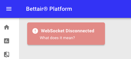
Websocket Disconnected
This error (see Figure 29) indicates that the bidirectional connection with the server is not working. This error affects the platform operation since various functionalities such as alarm notifications, and real-time updates of other organization members' actions cannot be executed.
Figure 29 Websocket error screenshot